BP Superfleet
Fleet management · Oil & Gas
Role
UI · Motion Design
Client
BP
BP was rebuilding their fleet management platform from scratch. My job: make it consistent, coherent, and actually usable — starting from five years of prior agency work that had never shipped.
Outcomes
After a year and a bit of working on this, the final decision from BP was to use this look and feel going forward, as it aligns with how bp as a business are heading but to go back to the drawing board in terms of the research and effectively start from scratch.
It was a bittersweet feeling if I am honest. It needed to go back to the drawing board much sooner and that was said by many people, including myself, so that the product could be scoped out properly and align with business objectives. However, we did crack the nut of the style moving forward, so none of this was wasted work and was planned to be used as the basis to move forward.
History and challenges
Five years. Four agencies—MMT Digital, IBM, Accenture, Thoughtworks. Zero releases. That was SuperFleet when I arrived: a design archive with no shared system, no consistency, and a client wary of changing anything after so long.
I joined to support three of seven dev squads, with one mandate: bring coherence to the existing work before the product could move forward.

A pragmatic approach
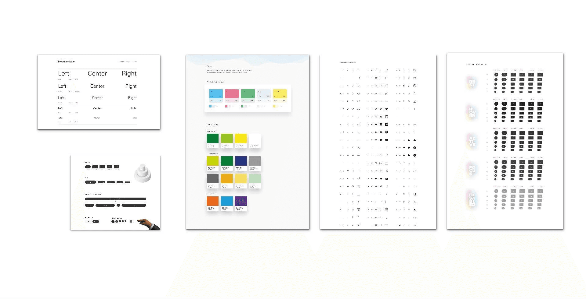
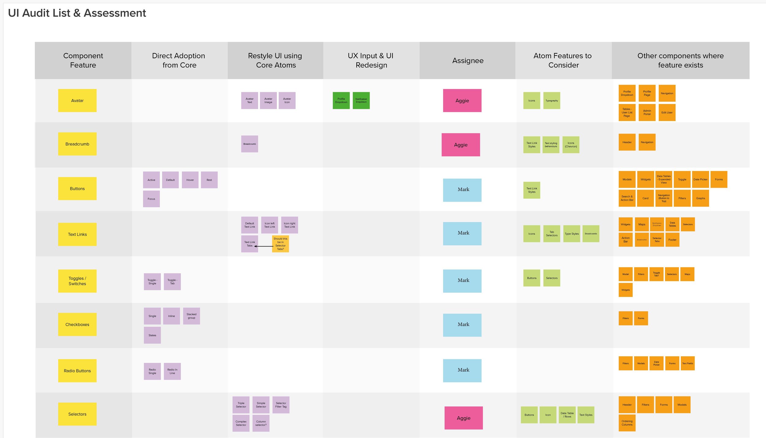
We audited the designs, mapped existing screens to the new BP Core atomic system, and rebuilt prioritised backlogs per squad. The inherited work became the foundation—the goal was coherence, not a rebuild.
BP Core was meant to cover 2,000 products but was still early-stage, so we built the missing components from scratch. The palette shifted from BP green to grey—a practical call for deuteranomaly accessibility. A two-person Core team in Texas were key collaborators throughout.
Push backs and challenges
As no official UX designers were assigned to the squad, the existing design structure was used as the foundation to build up and make improvements, with UX help as needed. Strange way of working I know.
The new Atomic design system covered 2000 BP products and was still in its early stages.
Working alongside the BP Core design team (2 people) with weekly check-ins. they were based in Texas, so the time difference caused issues.
The new Design system had atoms (colours, which were not accessible, icons, type, which were going to change at some point etc) but all off this was subject to change at some point and it very early stages. didn't really work for what we needed and hardly any molecules or organisms existed for the components we require. So it wasn't a case of just building out pages.
We made sure we had the Atoms we needed, then we could much quickly start to build molecules and organisms out fairly fast but making layout improvements to the pages and components from the previous design.
The style of this was going to move away from bp green to more of a grey feel for accessibility reason. Deuteranomaly is the most common type of red-green colour blindness. It makes green look more red. This was a company decision.
Worked very closely with the developers on this within the squad
Close relationship was setup with brand, as this needed to align with their direction but also to supply assets.
The components that were designed and approved by brand and also the design system team were then fed into the main Core library so that anyone else can use as a starting point for other products.
Push backs and challenges
Unclear brand direction. Product owners questioning design calls without the authority to make them. Squads sharing a codebase but rarely a vision. At times it felt like working in separate rooms with no shared floor plan.
We kept pushing for clarity. With enough components in place, we shifted from building pieces to assembling pages—working through review after review until it cohered.
Bringing it together
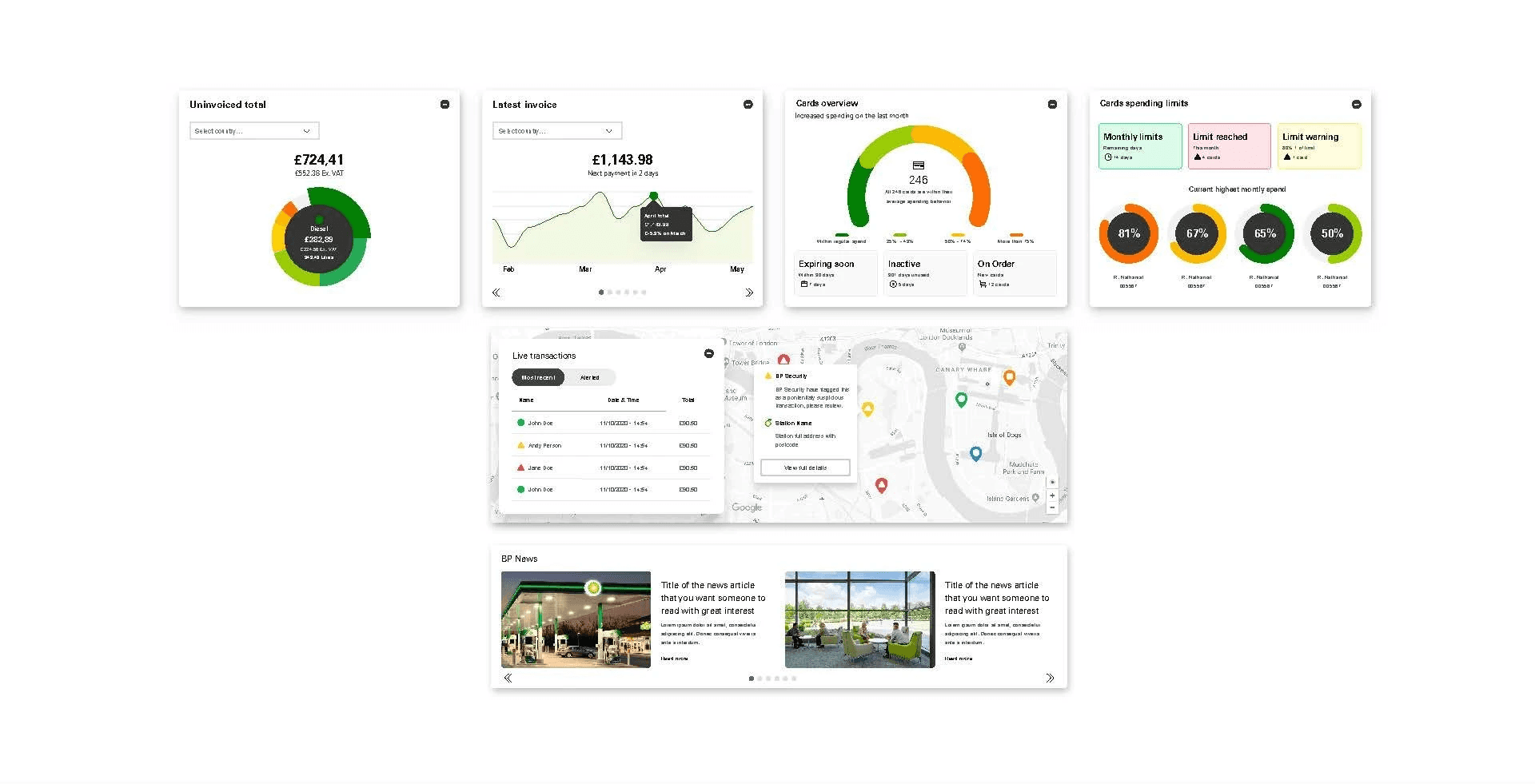
Once we had enough of the new components created, we were able to start creating pages to see how it all sat together. There was back and forth to get consistently in terms of the designs. Fine tuning.
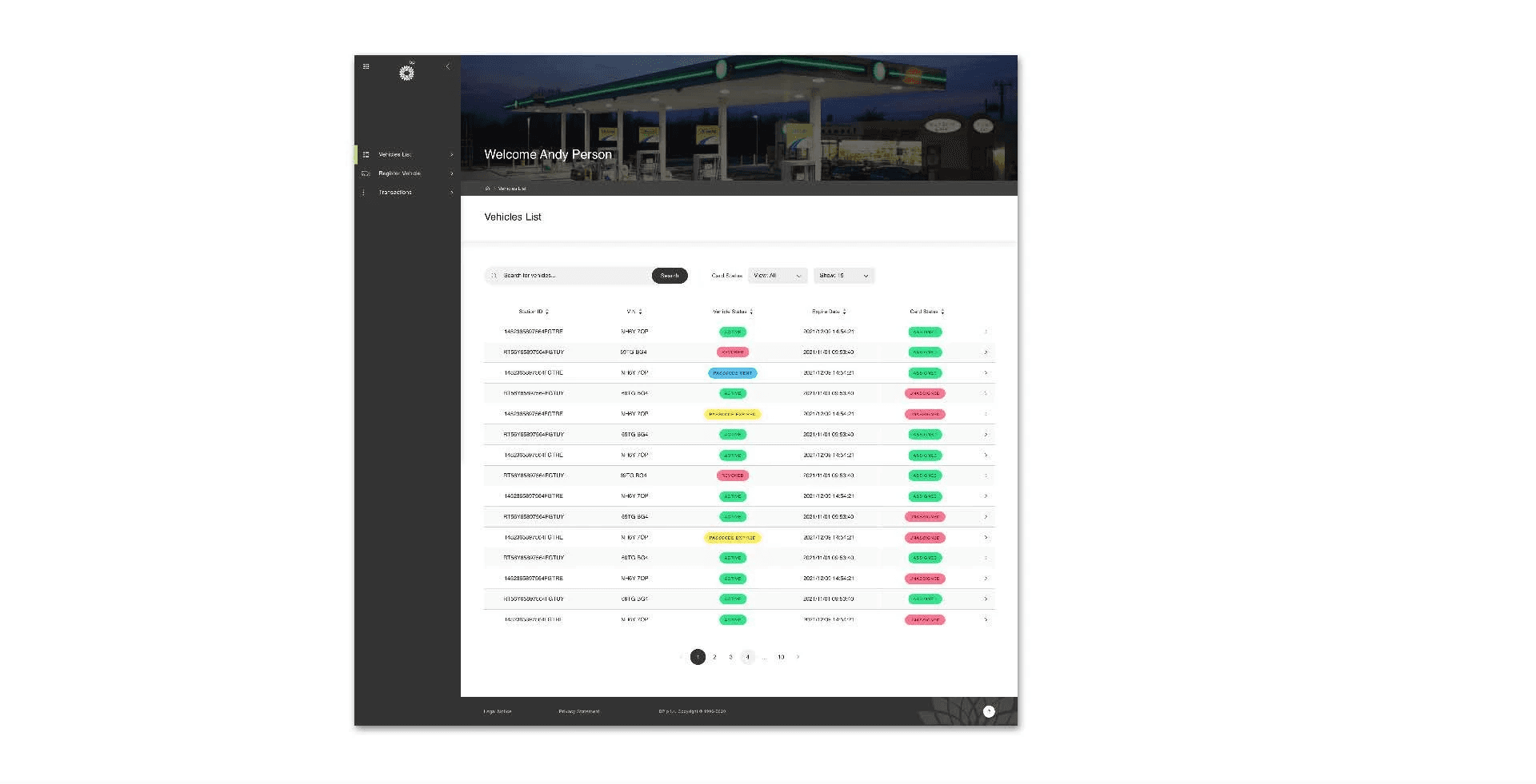

Going that bit further
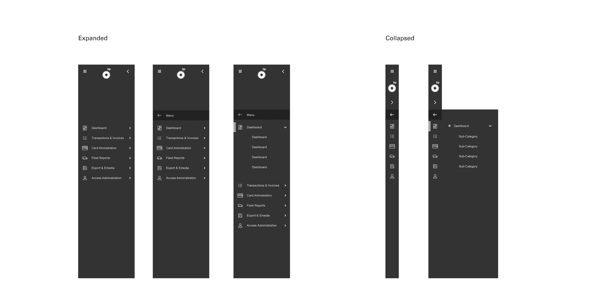
Static screens can’t show how something should feel. I built interactive animations for component behaviour—transitions, micro-interactions, sidebar states—giving developers and stakeholders more than specs to work from.
Next project