American Arbitration Association A3
A 4-day pitch — brand guidelines to digital experience
Role
UX and motion design
Client
American Arbitration Association
A pitch to hopefully win a much bigger piece of work. A3 had new brand guidelines and wanted to see how they’d transfer to their website, some LinkedIn posts—and critically—add movement. The timeframe was 4 days (5 technically, but I wasn’t going right to the wire).
I started with the brand guidelines, pulled out key phrases to anchor the work, and spent the first morning throwing spaghetti at the wall to see what stuck.
One phrase stood out: “For people who want better ways through conflict, frustrated by systems that stall, this should be more straightforward.” That became the anchor—designs with room to breathe, space to navigate, less overwhelm.
The approach
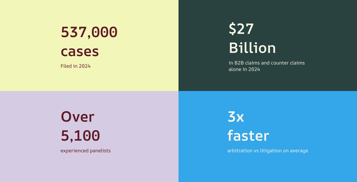
From that positioning, I gave the designs space: easier to navigate, less overwhelming, quicker to find what you need.
Two small UX wins: a chat in the hero for fast answers mid-arbitration, and AAA’s services surfaced upfront—so people find what they need without digging through the whole site.
Colour
I built on A3’s base colours—Maroon and Cream—then brought in secondary tones for side panels, titles and design details, adding variety without overdoing it.
Red for CTAs and accents—lines, pulls, highlights—enough to guide the eye and surface key info without overwhelming it.
Movement and interaction
Motion was a specific ask—they didn’t want a static site. Alongside the visual design, I explored how movement could bring the new brand to life.
Next project