American Arbitration Association A3
Client
American Arbitration Association
Role
Motion design, UI, AI art direction
Outcomes
The pitch was well received, both for how the new brand translated to the site and for how motion brought it to life. Conversations about taking the work forward are ongoing.
The pitch was well received, both for how the new brand translated to the site and for how motion brought it to life. Conversations about taking the work forward are ongoing.
Background
This was a pitch to win a much bigger piece of work. A3 had new brand guidelines and wanted to see them applied to their website and LinkedIn posts and, crucially, brought to life with motion. I had four days.
This was a pitch to win a much bigger piece of work. A3 had new brand guidelines and wanted to see them applied to their website and LinkedIn posts and, crucially, brought to life with motion. I had four days.
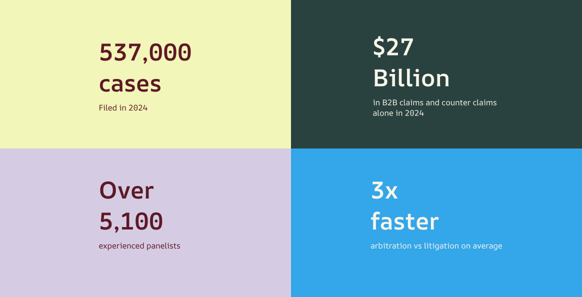
The approach
I pulled key phrases from the brand guidelines to anchor the work. One stood out: “For people who want better ways through conflict, frustrated by systems that stall, this should be more straightforward.” That shaped everything: designs with room to breathe, easier to navigate, quicker to find what you need.
I pulled key phrases from the brand guidelines to anchor the work. One stood out: “For people who want better ways through conflict, frustrated by systems that stall, this should be more straightforward.” That shaped everything: designs with room to breathe, easier to navigate, quicker to find what you need.
It also led to two small UX wins: a chat in the hero for fast answers mid-arbitration, and A3’s services surfaced upfront so people don’t have to dig through the site.
It also led to two small UX wins: a chat in the hero for fast answers mid-arbitration, and A3’s services surfaced upfront so people don’t have to dig through the site.
Colour
I built on A3’s Maroon and Cream and added secondary tones for side panels, titles and details.
I built on A3’s Maroon and Cream and added secondary tones for side panels, titles and details.
I kept red for CTAs and accents, enough to guide the eye without overwhelming it.
I kept red for CTAs and accents, enough to guide the eye without overwhelming it.
Directing AI performance
The brand imagery was too low-res for the pitch, so I upscaled it with AI, generated motion from it, then directed the result. Early passes had the usual AI tells: constant eye contact, non-stop hand gestures, expressions pitched too high, and no pauses. Real people glance away to think, rest their hands and stop to find a word. I refined it until the delivery felt natural. For a legal organisation, it had to feel like someone explaining something credibly, not presenting at you.
The brand imagery was too low-res for the pitch, so I upscaled it with AI, generated motion from it, then directed the result. Early passes had the usual AI tells: constant eye contact, non-stop hand gestures, expressions pitched too high, and no pauses. Real people glance away to think, rest their hands and stop to find a word. I refined it until the delivery felt natural. For a legal organisation, it had to feel like someone explaining something credibly, not presenting at you.
Movement and interaction
Motion was a specific ask: they didn’t want a static site. Alongside the visual design, I explored how movement could bring the new brand to life. The strongest example is on the homepage: cards and service tiles reveal as you scroll, and hovering a tile brings up its accent colour before you click through.
Motion was a specific ask: they didn’t want a static site. Alongside the visual design, I explored how movement could bring the new brand to life. The strongest example is on the homepage: cards and service tiles reveal as you scroll, and hovering a tile brings up its accent colour before you click through.
ALWAYS THINKING…ALWAYS LEARNING…ALWAYS CREATINg
ALWAYS THINKING…ALWAYS LEARNING…ALWAYS CREATINg
…SOMETHING
…SOMETHING
ALWAYS THINKING…ALWAYS LEARNING…ALWAYS CREATINg
ALWAYS THINKING…ALWAYS LEARNING…ALWAYS CREATINg
…SOMETHING
…SOMETHING